


Content ITV PRO
This is Itvedant Content department
Design Web Pages for ChaloChale (Signup, Signin & Booking Form)
Business Scenario
Text
Pre-Lab Preparation
Text
Topic : Before starting this lab, revise the following topics
git pull origin branchNameGit Pull
Task 1: Create Sign-Up Page (signup.html)
Create signup.html file and add Bootstrap Starter Template + Navbar
1
1
1
1
1
1
1
1
1
1
1
1
1
1
1
1
<!DOCTYPE html>
<html lang="en">
<head>
    <meta charset="UTF-8">
    <meta name="viewport" content="width=device-width, initial-scale=1.0">
    <title>ChaloChale Travel App</title>
    <link href="https://cdn.jsdelivr.net/npm/bootstrap@5.3.3/dist/css/bootstrap.min.css" rel="stylesheet">
    <link rel="stylesheet" href="css/style.css"/>
</head>
<body>
    <div class="container">
        <div class="row">
            <div class="col-md-12">
                <!-- Navbar Start -->
                <nav class="navbar navbar-expand-lg navbar-dark bg-dark">
                <div class="container">

                    <a class="navbar-brand fw-bold" href="#">
                    <i class="fa-solid fa-plane-departure"></i> ChaloChale
                    </a>

                    <button class="navbar-toggler" type="button" data-bs-toggle="collapse" data-bs-target="#menu">
                    <span class="navbar-toggler-icon"></span>
                    </button>

                    <div class="collapse navbar-collapse" id="menu">
                    <ul class="navbar-nav ms-auto">
                        <li class="nav-item"><a class="nav-link active" href="index.html">Home</a></li>
                        <li class="nav-item"><a class="nav-link" href="destinations.html">Destinations</a></li>
                        <li class="nav-item"><a class="nav-link" href="packages.html">Packages</a></li>
                        <li class="nav-item"><a class="nav-link" href="booking.html">Booking</a></li>
                        <li class="nav-item"><a class="nav-link" href="contact.html">Contact</a></li>
                    </ul>
					<a href="signup.html" class="btn btn-warning ms-lg-3">Signup</a>
                    <a href="login.html" class="btn btn-warning ms-lg-3">Login</a>
                    </div>

                </div>
                </nav>
                <!-- Navbar End -->
                </div>
            </div><!-- navbar row end-->


<!-- Footer -->
<footer class="bg-dark text-white text-center py-3">
  <p class="mb-0">© 2026 ChaloChale Travel App | Designed with Bootstrap</p>
</footer>

    </div>

    <script src="js/script.js"></script>
    <script src="https://cdn.jsdelivr.net/npm/bootstrap@5.3.3/dist/js/bootstrap.min.js"></script>
</body>
</html>
Add signup form code in signup.html
2
add signup button in navbar - in all html files
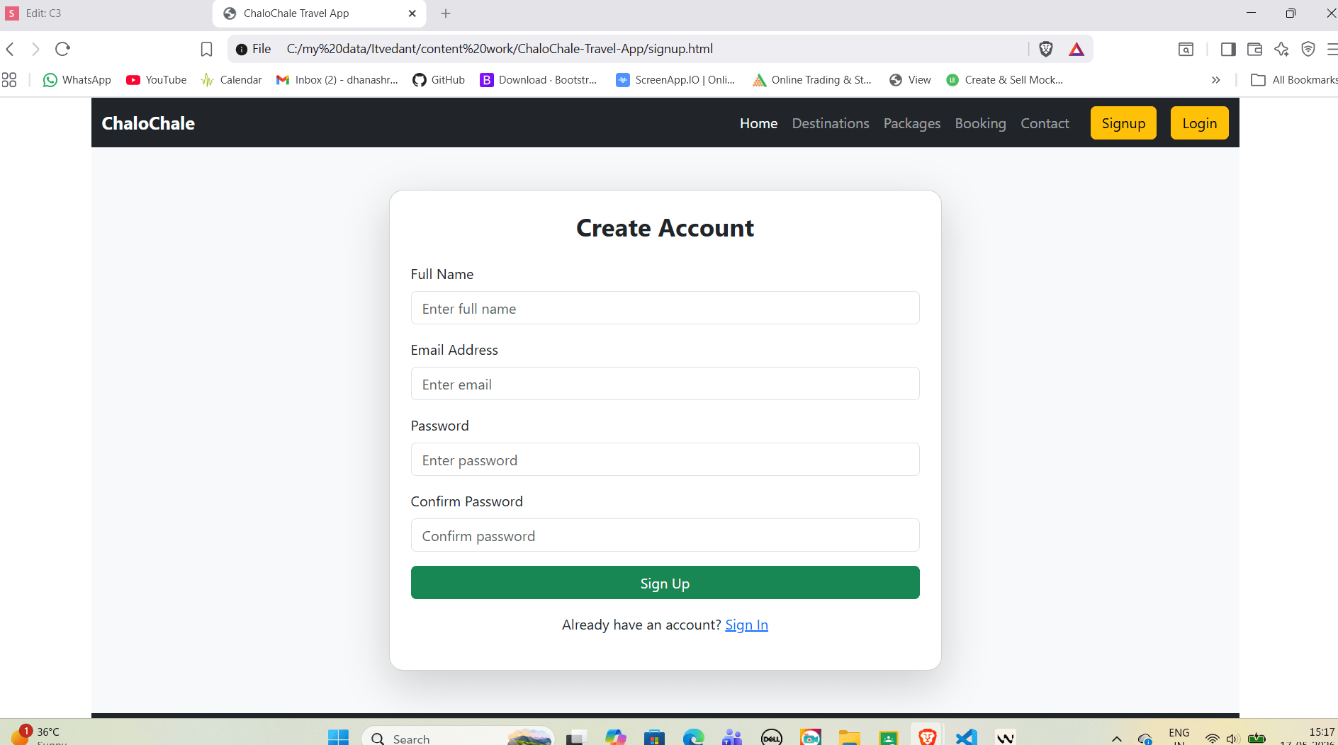
<!-- Signup Form -->
  <section class="py-5 bg-light">
    <div class="container">
      <div class="row justify-content-center">

        <div class="col-12 col-md-8 col-lg-6">
          <div class="card shadow-lg p-4 rounded-4">
            <h3 class="text-center fw-bold mb-4">Create Account</h3>

            <form>
              <div class="mb-3">
                <label class="form-label">Full Name</label>
                <input type="text" class="form-control" placeholder="Enter full name">
              </div>

              <div class="mb-3">
                <label class="form-label">Email Address</label>
                <input type="email" class="form-control" placeholder="Enter email">
              </div>

              <div class="mb-3">
                <label class="form-label">Password</label>
                <input type="password" class="form-control" placeholder="Enter password">
              </div>

              <div class="mb-3">
                <label class="form-label">Confirm Password</label>
                <input type="password" class="form-control" placeholder="Confirm password">
              </div>

              <button type="submit" class="btn btn-success w-100">
                Sign Up
              </button>

              <p class="text-center mt-3">
                Already have an account? <a href="login.html">Sign In</a>
              </p>

            </form>
          </div>
        </div>

      </div>
    </div>
  </section>
Output
1
Task 2: Create Sign-In Page (login.html)
Create login.html file and add Bootstrap Starter Template + Navbar
2
Add login form code in login.html
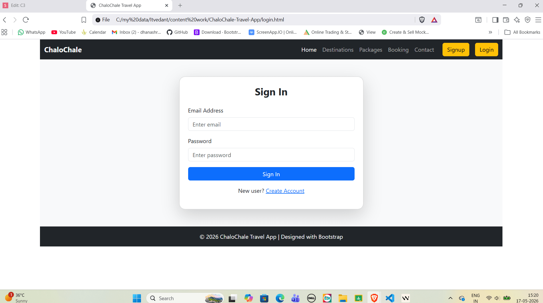
<!-- Login Form -->
        <section class="py-5 bg-light">
            <div class="container">
            <div class="row justify-content-center">

                <div class="col-12 col-md-7 col-lg-5">
                <div class="card shadow-lg p-4 rounded-4">
                    <h3 class="text-center fw-bold mb-4">Sign In</h3>

                    <form>
                    <div class="mb-3">
                        <label class="form-label">Email Address</label>
                        <input type="email" class="form-control" placeholder="Enter email">
                    </div>

                    <div class="mb-3">
                        <label class="form-label">Password</label>
                        <input type="password" class="form-control" placeholder="Enter password">
                    </div>

                    <button type="submit" class="btn btn-primary w-100">
                        Sign In
                    </button>

                    <p class="text-center mt-3">
                        New user? <a href="signup.html">Create Account</a>
                    </p>

                    </form>
                </div>
                </div>

            </div>
            </div>
        </section>
Output
Output
<!-- Login Form -->
  <section class="py-5 bg-light">
    <div class="container">
      <div class="row justify-content-center">

        <div class="col-12 col-md-7 col-lg-5">
          <div class="card shadow-lg p-4 rounded-4">
            <h3 class="text-center fw-bold mb-4">Sign In</h3>

            <form>
              <div class="mb-3">
                <label class="form-label">Email Address</label>
                <input type="email" class="form-control" placeholder="Enter email">
              </div>

              <div class="mb-3">
                <label class="form-label">Password</label>
                <input type="password" class="form-control" placeholder="Enter password">
              </div>

              <button type="submit" class="btn btn-primary w-100">
                Sign In
              </button>

              <p class="text-center mt-3">
                New user? <a href="signup.html">Create Account</a>
              </p>

            </form>
          </div>
        </div>

      </div>
    </div>
  </section>
click on download and then complete installation
2
Task 3: Use WindSurf AI for Auto Code Suggestions
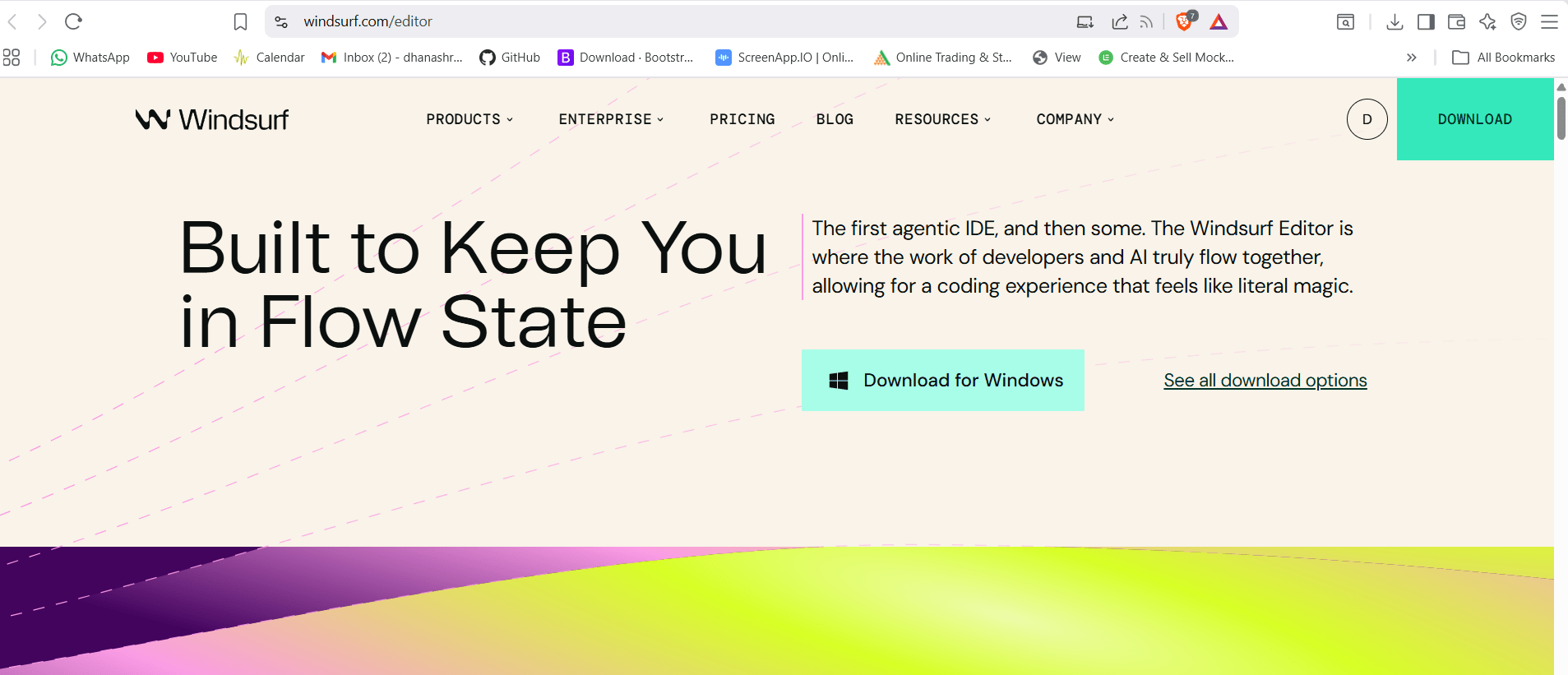
Download WindSurf AI (Official Way)
1
official WindSurf website : windsurf.com
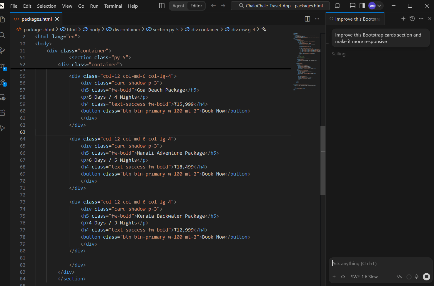
Open your project in WindSurf AI
3
Where to Ask WindSurf AI for Suggestions?
4
1) Open Chat Panel
2) Select Your File
3) Ask AI Suggestion using prompt like - Improve this Bootstrap cards section and make it more responsive.
4)apply suggested code
click on - Accept All or Accept file
Use Chat Panel (Recommended)
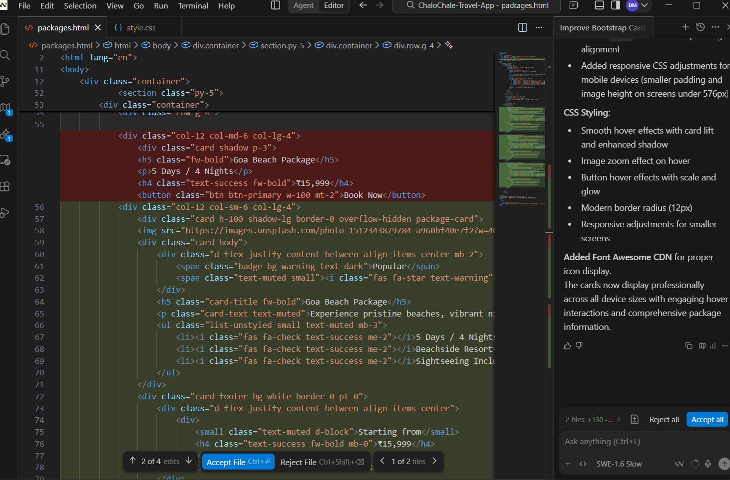
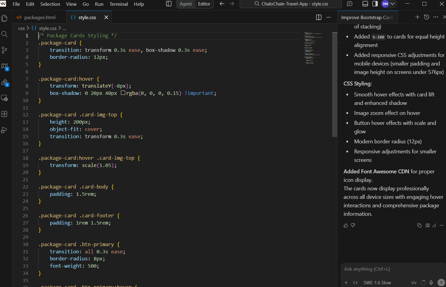
5) check the css properties added in style.css file after clicking on accept file
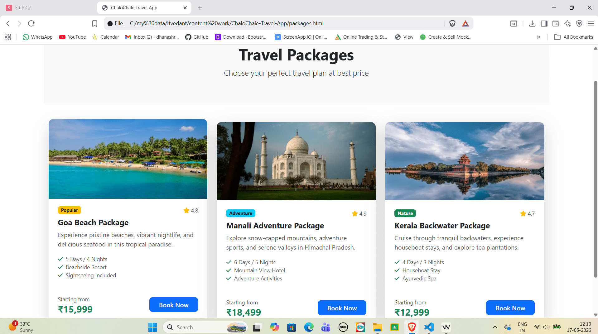
Output
After applying WindSurf AI Suggestions)
1)The layout looks more clean and professional.
2)Cards have better spacing between and appear with rounded corners using rounded-3)Shadow effect becomes more attractive using shadow-lg,Buttons look more modern with better alignment and full width using w-100.
4))On mobile screen, cards automatically shift into single column layout, On tablet screen, cards align into two columns, On desktop screen, cards align into three columns.
Great job!
You have successfully completed the responsive layout implementation for ChaloChale Travel App.
In this lab, you have:
1)Created Destinations page using responsive cards
2)Created Packages page using Bootstrap grid layout
3)Used WindSurf AI to enhance UI design and layout suggestions
4)Practiced Bootstrap responsive classes for multiple screen sizes
You are now ready to build the Booking page and Contact page with interactive forms and validation.
Checkpoint
Git Push
git push origin branchNameBy Content ITV


