


Content ITV PRO
This is Itvedant Content department
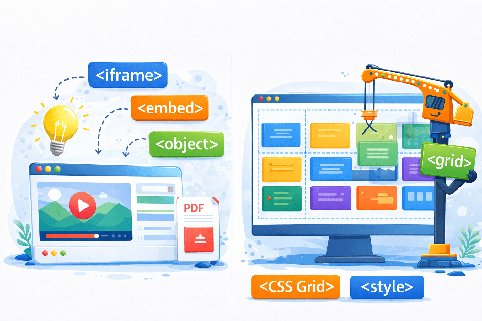
HTML Embedding Tricks & Grid Layouts
Learning Outcome
1
What is Grid Layout
2
Different Grid Layout Properties
3
What is iframe tag and how to use it?
How Can We Embed YouTube Videos on a Webpage and Arrange Them in a Grid Layout?
Using Grid layout and iframe tag
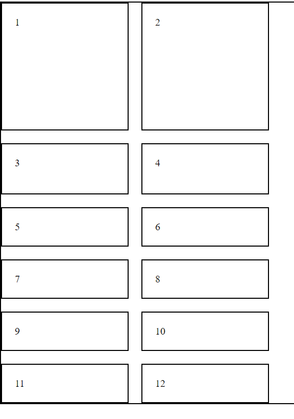
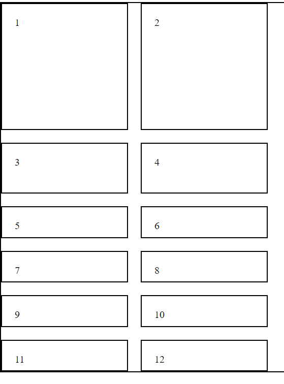
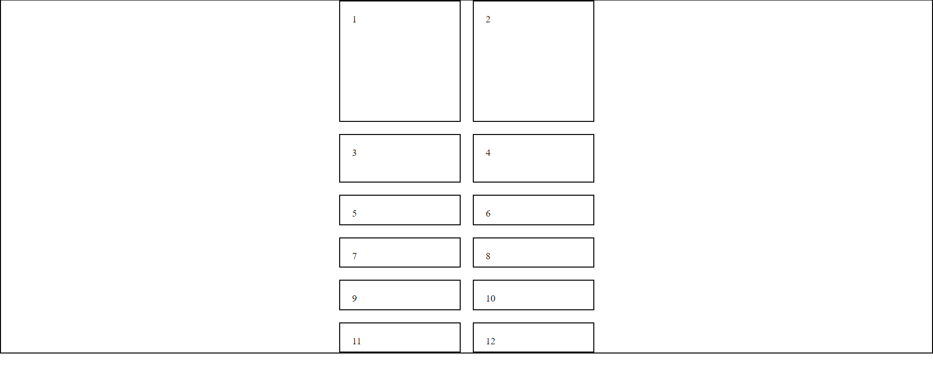
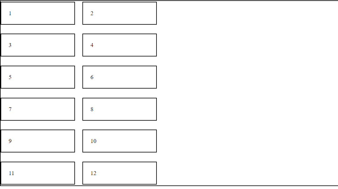
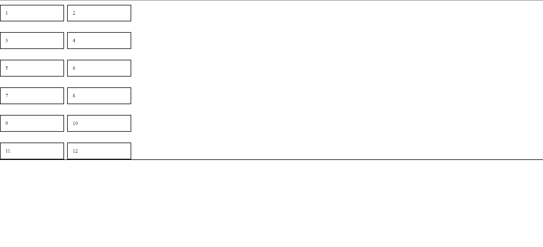
What Is Grid Layout?
A grid layout in HTML is a CSS system that arranges elements in rows and columns
grid-template-row (Height)
grid-template-column (Width)
How Can We Use Grid Layout?
Using the display: grid; property, allowing for flexible and responsive design
.container {
border: 2px solid blue;
display: grid;
What Are Different Grid Layout Properties?
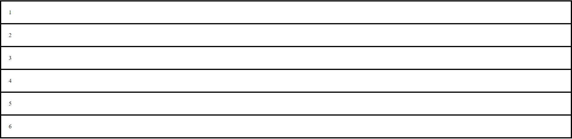
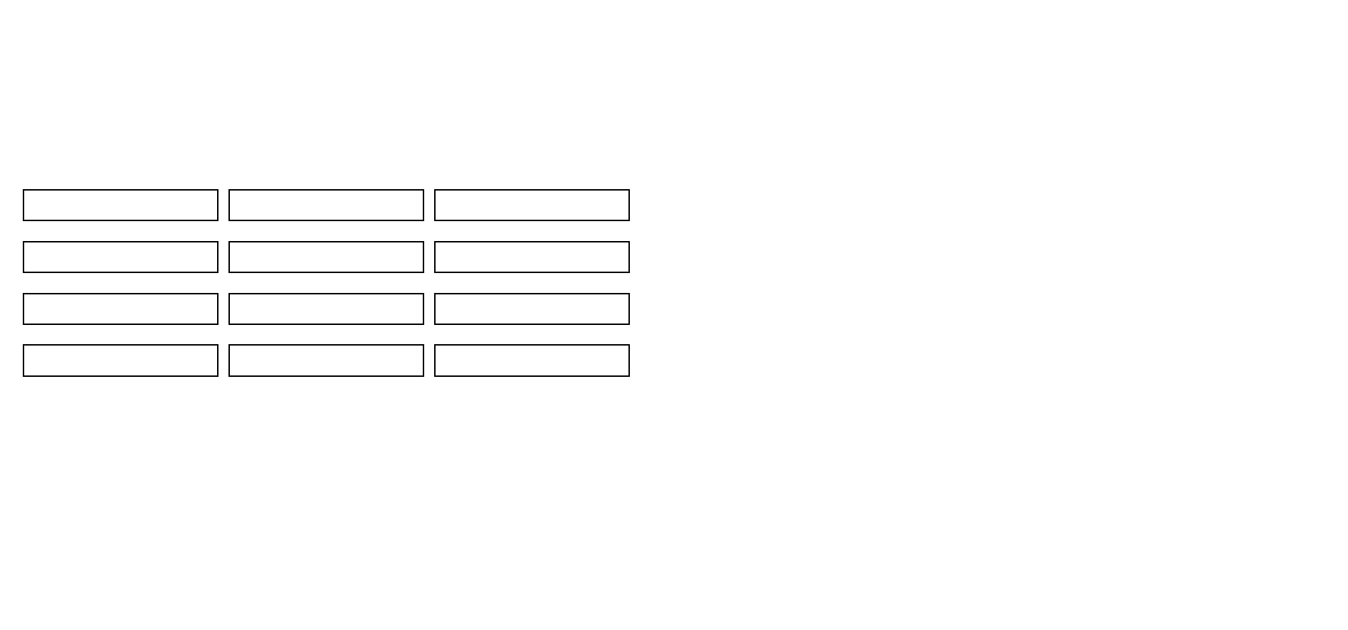
Grid container properties are CSS attributes used to control the layout, alignment, and spacing of items within a grid container
Let's look at them one by one
grid-template-columns
justify-content
gap
grid-template-rows
align-content
align-items
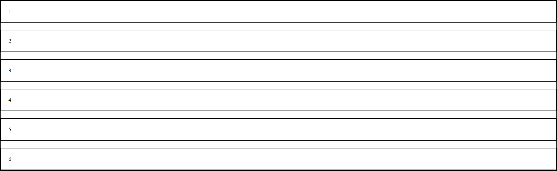
What Is gap Property?
The gap property is used to define the spacing between rows and columns within a grid container
.grid-container {
    border: 2px solid black;
    display: grid;
    gap: 20px;
}
What Is grid-template-columns?
grid-template-columns is used in the CSS Grid Layout module to define the number, size, and layout of columns in a grid container
.grid-container {
border: 2px solid black;
display: grid;
gap: 20px;
grid-template columns: 100px 200px 300px;
}What Is grid-template-columns?
.grid-container {
border: 2px solid black;
display: grid;
gap: 20px;
grid-template columns: 20% 20% 10%;
}We can also use percentages to create responsive column widths
grid-template-columns is used in the CSS Grid Layout module to define the number, size, and layout of columns in a grid container
What Is grid-template-columns?
.grid-container {
border: 2px solid black;
display: grid;
gap: 20px;
grid-template columns: 20vw 20vw 10vw;
}`vw` is used to set responsive column widths based on the viewport width
grid-template-columns is used in the CSS Grid Layout module to define the number, size, and layout of columns in a grid container
.grid-container {
border: 2px solid black;
display: grid;
gap: 20px;
grid-template columns:2fr 1fr 1fr;
}'fr' allows to allocate a fraction of the available space to columns, ensuring a flexible and responsive layout
.grid-container {
border: 2px solid black;
display: grid;
gap: 20px;
grid-template columns: repeat(4, 1fr);
}This is the another way to write using 'fr'
.grid-container {
border: 2px solid black;
display: grid;
gap: 20px;
grid-template columns: repeat(auto-fill, 300px);
}auto-fill with px values in grid-template-columns to create a responsive grid that adjusts based on available space
.grid-container {
border: 2px solid black;
display: grid;
gap: 20px;
grid-template columns: auto auto;
}'auto auto' creates two columns that adjust their widths based on their content, making the layout responsive
.grid-container {
border: 2px solid black;
display: grid;
gap: 20px;
grid-template columns: 200px auto;
}Creates a 200px wide first column and a responsive second column that adjusts to its content
What Is grid-template-rows?
'grid-template-rows' defines the number of rows in a grid layout and specifies the height of each row
.grid-container {
border: 2px solid black;
display: grid;
gap: 20px;
grid-template-columns: 200px 200px;
grid-template-rows: 200px 80px;
}Sets the first row of a grid to 200 pixels tall and the second row to 80 pixels tall
.grid-container {
    border: 2px solid black;
    display: grid;
    gap: 20px;
    grid-template-columns: 200px 200px;
    grid-template-rows: 200px 80px;
    grid-auto-rows: 50px; }
Sets the height of any automatically created rows in a grid to 50 pixels
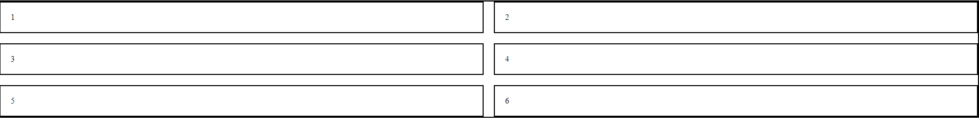
What Is justify-content?
`justify-content` is used to align items along the main axis (horizontally for rows or vertically for columns) within a grid container
.grid-container {
    display: grid;
    gap: 20px;
    grid-template-columns: 200px 200px;
    grid-template-rows: 200px 80px;
    grid-auto-rows: 50px;
    justify-content: center; }
Centers the items along the main axis of the container
centers the items along the main axis of the container
What Is align-content?
Centers multiple lines of items along the cross-axis within the container
.grid-container {
    display: grid;
    gap: 20px;
    grid-template-columns: 200px 200px;
    align-content: center; }
`align-content` is used to align multiple lines of items within a flex container or a grid container along the cross-axis
Centers multiple lines of items along the cross-axis within the container.
Centers multiple lines of items along the cross-axis within the container.
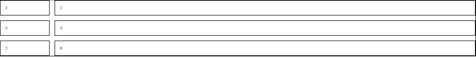
What Is align-items?
`align-items` is used to align items along the cross-axis within a single line
.grid-container {
    display: grid;
    gap: 20px;
    grid-template-columns: 200px 200px;
    align-items: center; }
Aligns the items along the cross-axis within their container
What Is align-items?
Aligns the items along the cross-axis within their container
Centers multiple lines of items along the cross-axis within the container.
How do We Adjust the Layout of Specific Items within a Grid Container?
Using Grid children properties
How do We Adjust the Layout of Specific Items within a Grid Container?
Using Grid children properties
What Are Different Children Properties?
Grid children properties are used to adjust the layout and appearance of individual items within a grid container
justify-self
align-self
grid-column
grid-row
grid-area
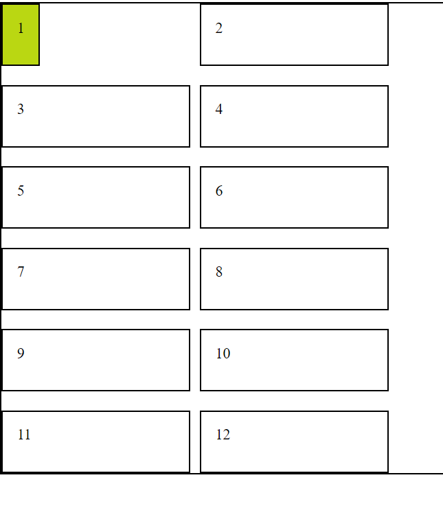
What Is justify-self?
`justify-self` is used in grid layouts to align an individual grid item along the inline (row) axis within its grid cell
#item1{
    background-color: #bad712;
    justify-self: start;
}
Aligns an individual grid item to the start of its grid cell along the inline (row) axis within the container
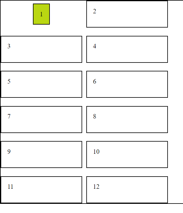
What Is align-self?
`align-self` is used to override the `align-items` property for a specific item, allowing you to align an individual item along the cross-axis
#item1{
background-color: #bad712;
justify-self: start;
align-self: center;
}Centers an individual item along the cross-axis within its container
How align-self Works with justify-self?
Centers an individual item along the cross-axis within its container
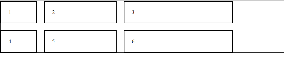
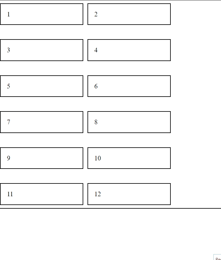
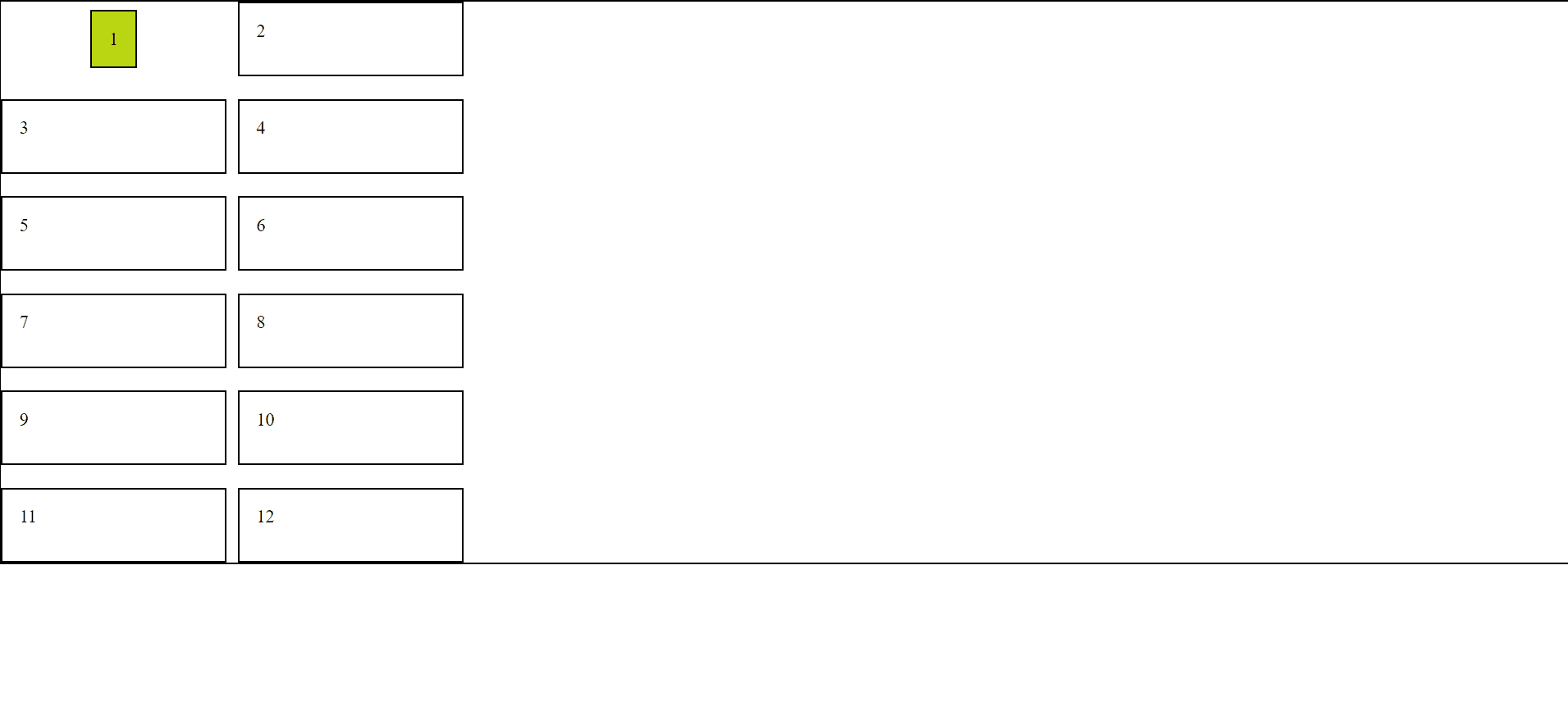
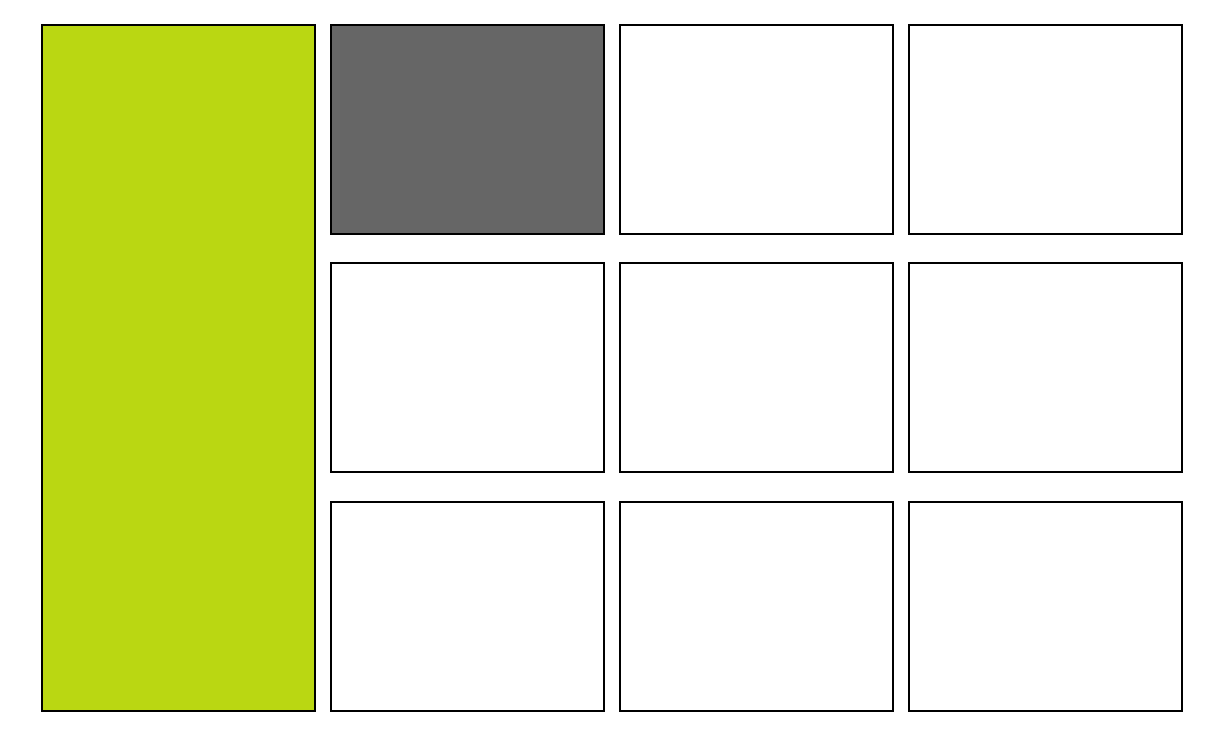
How Can We Achieve this kind of Layout?
grid-template-row (Height)
grid-template-column (Width)
Using grid-row and grid-column
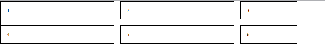
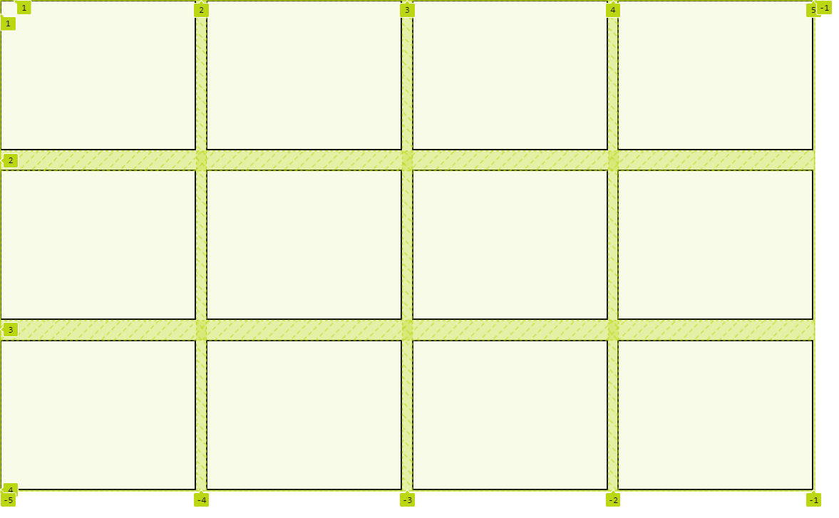
What Is grid-row and grid-column?
'grid-row' and 'grid-column' are used to define the starting and ending positions of a grid item within the grid
.grid-item {
  grid-row: 1 / 3;
  grid-column: 2 / 4;
}
Here row starts at row line 1 and ends at row line 3 and
column starts line 2 and ends at column line 4
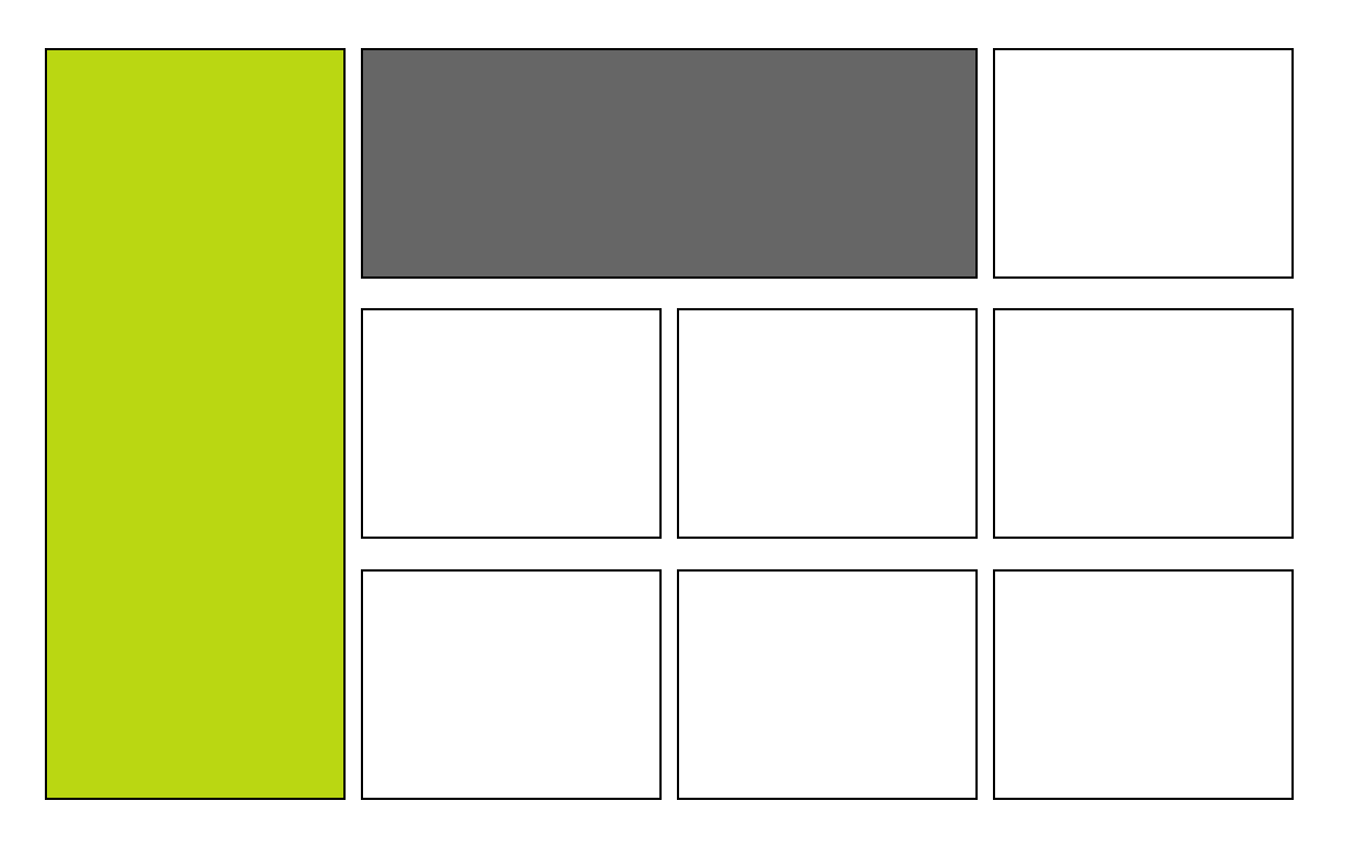
How grid-row and grid-column is Used?
#item1{
background-color: #bad712;
grid-row: 1 / 4;
}
#item2{
background-color: #666666;
grid-column: 2 / 4;
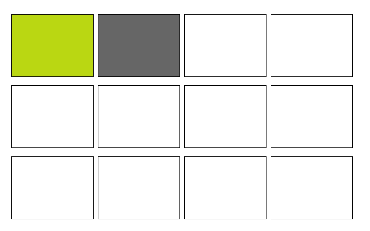
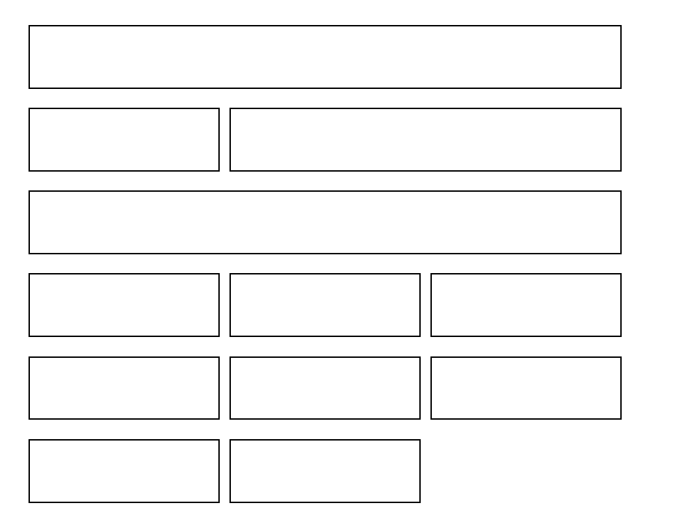
}Now What is grid-area?
We use the grid-area property in grid items to assign them to specific named areas defined in the grid container
#item1{
grid-area: header;
}
#item2{
grid-area: sidebar;
}
#item3{
grid-area: content;
}
#item4{
grid-area: footer;
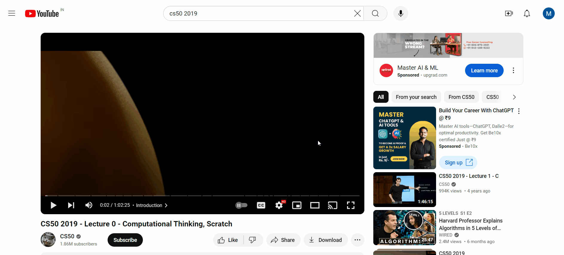
}How Can We Embed YouTube Videos and Maps on Our Website?
Using iframe tag
What is an iframe Tag?
The iframe tag embeds external content (videos, maps, etc.) from another website into your webpage like a mini-browser window
How iframe Tag Works?
<iframe src="URL" height="HEIGHT" width="WIDTH"></iframe>
Embed content's URL (video, map, etc.) This is essential for the iframe to function
Control the size of the iframe element, defining how much space it occupies on your webpage
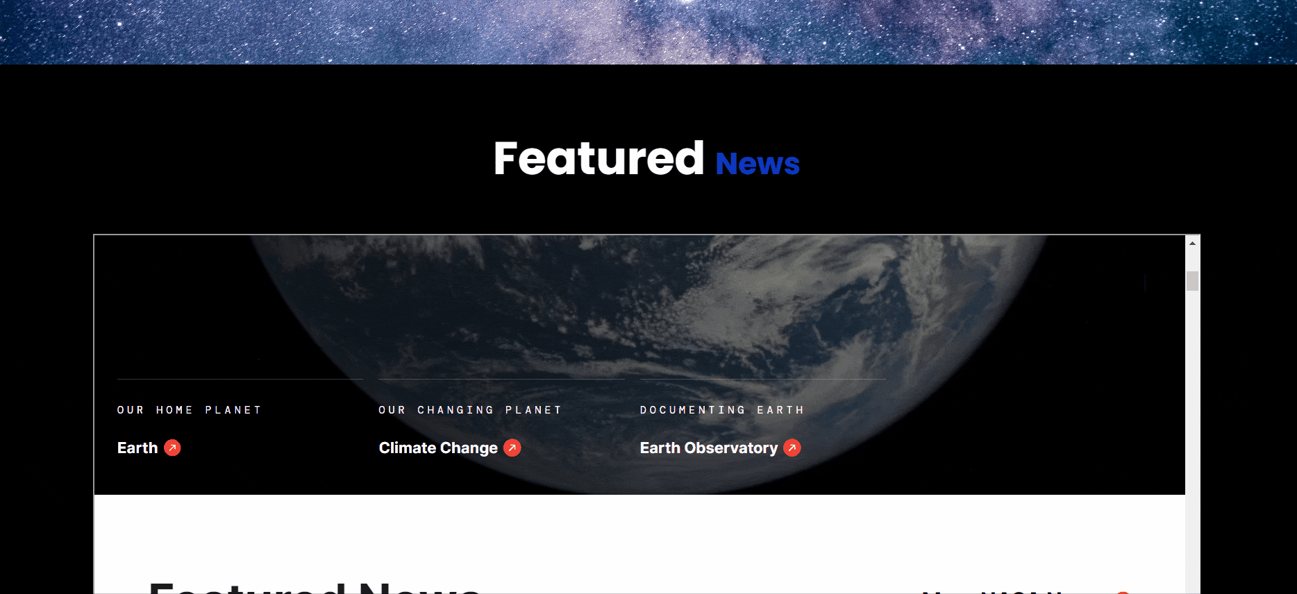
How to Embed External Website?
<iframe class="iframe-container" src="https://www.nasa.gov/"
width="100%" height="410px"></iframe>
How to Embed Youtube Videos?
How to Embed Youtube Videos?
<iframe width="560" height="315"
src="https://www.youtube.com/embed/AVoV0IDivAQ?si=40TdxZc2_cizjV-w"
title="YouTube video player" frameborder="0"
allow="accelerometer; autoplay; clipboard-write;
encrypted-media; gyroscope; picture-in-picture; web-share"
referrerpolicy="strict-origin-when-cross-origin" allowfullscreen></iframe>
This attribute specifies a list of features that the iframe is allowed to use
Using the Share > Embed > iframe option is the standard way to integrate YouTube videos and maps into websites
How to Embed Youtube Videos?
<iframe width="560" height="315"
src="https://www.youtube.com/embed/AVoV0IDivAQ?si=40TdxZc2_cizjV-w"
title="YouTube video player" frameborder="0"
allow="accelerometer; autoplay; clipboard-write;
encrypted-media; gyroscope; picture-in-picture; web-share"
referrerpolicy="strict-origin-when-cross-origin" allowfullscreen></iframe>
accelerometer
autoplay
clipboard-write
encrypted-media
gyroscope
picture-in-picture
web-share
Allows the use of motion sensors
Allows the video to start playing automatically
Allows writing to the clipboard
Allows the use of encrypted media
Allows the use of the gyroscope sensor
Allows the video to be played in picture-in-picture mode
Allows the use of the Web Share API
How to Embed A Map?
By Content ITV


